05 | CASE STUDY (2018)
Redesigning and unifying Intuit’s bespoke product brands
Intuit is a financial software company that offers solutions for tax preperation, small business accounting / bookkeeping, as well as personal finance management. This use case goes over the redesign efforts for their suite of logos and brands.
Overview
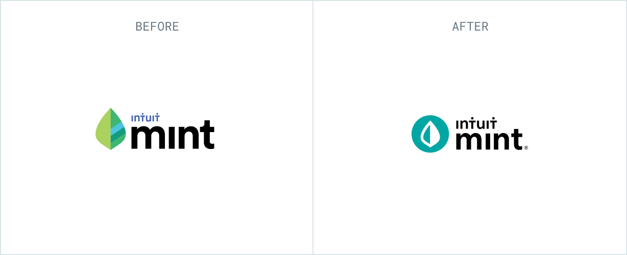
The year was 2015, and Intuit set out on a journey to go from a house of brands, to a branded house. The bespoke brands had nothing in common and the only attempt to unify them was the placement of an Intuit logo somewhere in each product logo.

Design approach
I joined the team in late 2017. Prior to that, all branding was outsourced to external agencies. My initial goal was to break down the work into fundamental design elements that helped guide the team through critiques and approvals while allowing us to make progress in incremental phases.

COLOR

GRID

MARK

TYPE
Going broad...
By decoupling the logo mark from type, we were able to continuously iterate with daily/weekly design reviews. Throughout the process, we explored metaphors that resonated with the product benefits and individual brand attributes.

... going narrow
As we narrowed on some marks, others needed more explorations. We leveraged qualitative research to see what resonated with customers. After 15 rounds of revisions, below are the final logo marks.

Typography
Throughout the process, we examined logo type treatments by dissecting various fonts from each business unit. Special consideration was made to the font weight of AvenirNext so the logos could scale for the web. The result was a custom font weight only for the logotype.

Font Attributes

Atomic Grid

Custom Font Weight
Final Logo
In the spring of 2018, Intuit finally became a branded house. The redesigned logos began to rollout in all collateral and product experiences. Soon after, the formation of Intuit’s first design system kicked off a new era of product unification.

