Overview
Berkeley is split into 2 major internal segments, Admissions and Advancement. I was extremely fortunate to join the University Relations Department within Advancement to help Berkeley with their centralized fundraising and donor engagement mission.
OLD LOGO
NEW LOGO
Goal
I was tasked to steward the application of Berkeley’s new logo/brand whilst enhancing their customer experiences through donor portals and other print/online marketing communications and achieve our fundraising goals.


Design approach
Design systems are standard practice now. But in 2014, this was a new concept for everyone, especially in higher education. My initial focus was on 2 foundational elements, color and type. My goal was to fix or add new colors to the system whilst finding typography that complimented Berkeley’s brand and kick off a new era of design.

COLOR
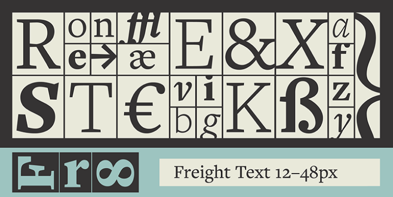
TYPE
Opportunities
With some design assets and styles in place, my next challenge was to improve the usability for their primary giving portal. There were several opportunities, but 2 stood out the most.


1. Suggestions
There was very little help for new or existing users that didn’t know how to start a donation.

2. Search
The search functionality was extremely outdated and did not render results dynamically.
1. Suggestions
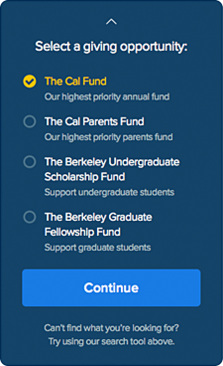
Flipping the paradigm...
Choose the amount first, then guide users where to donate next.
From research and previous data points, we knew most users had a dollar amount predetermined. However, they weren’t really sure where, or how, to donate their money. This can lead to analysis paralysis, in which a user abandons the experience because they aren’t properly guided.
We created this widget to guide all users through a simple decision tree that simplified the process into a few easy steps.
Step 1:

Step 2:

Step 3:
2. Search
Help them find anything...
Adding a quick search that returns federated results immediately.
The previous search functionality was extremely outdated. The entire experience was not dynamic, meaning that a list of results was only rendered once they clicked the search button and went to the next page.
We sourced several data domains in our federated search and tediously tweaked things in order to be highly performant on many browser types.

Outcome
The new giving portal successfully launched in Fall 2014, just in time for the new school year. With a new year, comes new campaigns and new fundraising goals. We utilized the summer break to create additional collateral and marketing material that would help boost awareness and engagement.

MVP Experience
The giving portal was redesign and rebuilt from the ground up. Some changes were small, while others were drastic departures.
- Iconic campus photography to instill emotion
- Created more prominent call to actions and additional motivating content
- Widgetized experiences for easy embedding on microsites and other fundraising campaigns
- Bootstrap responsive framework
- Typekit font replacement
- Federated quick search
- Dynamic international address fields
- Custom sub-branded templates for schools and giving areas